Short answer - filter: blur()
Introduction
CSS Filters are an effective tool developers can use to achieve varying visual effects. Primarily they are used to apply visual changes to images. However, for the purposes of our demo, we are going to use it on text.
We will use a blur filter function that applies a Gaussian blur to the input image or text. The value of ‘radius’ defines the value of the standard deviation to the Gaussian function, or how many pixels on the screen blend into each other, so a larger value will create more blur.
Implementation
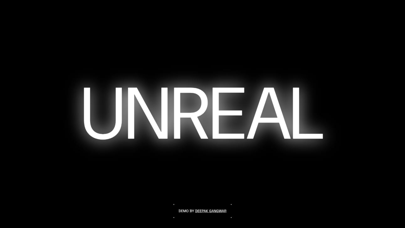
The trick is to add a text block with a blur filter applied to it and then add the exact text on top of it. The blur gives the compiled title emissive light. Thus the layered text creates an effect of a streetlight glow.
Now here is how to make it. Start by adding some variables. 🌱
:root {
  --ease-out-circ: cubic-bezier(0.075,0.82,0.165,1);
}

*, :after, :before {
  box-sizing: border-box;
}
Time to add the heading on which you want to apply the effect. We have made it so that only CSS matters for it to work. Just add a class .blur to any element, and it should be enough.
<span class="blur">Unreal</span>Now comes the magic ✨
.blur::after {
  content: "UNREAL";
  display: inline-block;
  position: absolute;
  left: 0;
  top: 0;
  right: 0;
  bottom: 0;
  animation: blurring 2.5s infinite var(--ease-out-circ);
}
Since we are using ::after pseudo-selector, make sure to add the exact string in the content property as the text you want to apply this effect to. This pseudo-element has the position set to absolute, so it lies just underneath our primary text.
Time to apply some blur to it. This can be done simply by adding filter: blur(15px) here, but we want it to flicker just like a streetlight. And the great thing about filters is that they are animatable. That is why we are using CSS keyframes animation.
To create the animation 🎥
@keyframes blurring {
  0% {
    filter: blur(2.0833333333vw);
  }

  100% {
    filter: blur(1.3888888889vw);
  }
}
Below is the codepen link. Feel free to tweak around and share your results with me on Twitter. If you liked this read, feel free to subscribe to the newsletter.

